

Understanding the profound impact of colours on our emotions and perceptions, this guide offers invaluable insights into the psychology of hues, guiding you toward the colours that resonate with your unique personality and style.
From vibrant accent walls to soothing neutrals, we explore how the careful interplay of colours can transform the ambience of each room, evoking feelings of tranquillity, energy, or creativity.
Whether you’re redesigning your entire home or are feng shui inspired to revamp a single room, this guide is designed to be your trusted companion on the journey to creating a colour palette that speaks to your soul, bringing a sense of balance, coherence, and beauty to your living spaces.
Crafting a Harmonious Colour Palette: Strategies for Home Colour Selection
In crafting a harmonious and inviting living environment, the art of selecting the perfect colour palette takes centre stage. The focus is on providing you with practical and effective strategies for choosing the ideal colours.
From exploring colour schemes that complement each other to utilizing accent colours for added depth, we delve into the various techniques that ensure a seamless and visually appealing colour composition.
Some of the key strategies that will help you reflect your personal style through the power of colours include:
- Explore Colour Schemes: Familiarize yourself with different colour schemes, such as monochromatic, analogous, complementary, and triadic.
- Utilize the 60-30-10 Rule: Adhere to the 60-30-10 rule, allocating 60% of the room to a dominant colour, 30% to a secondary colour, and 10% to an accent colour.
- Consider Lighting: Factor in the natural and artificial lighting in each room when selecting colours.
- Create Cohesion: Achieve a sense of cohesion throughout your home by choosing a common colour element that appears in multiple rooms.
- Sample and Test: Before committing to a full-colour palette, gather paint samples and apply them on your walls.
Let’s unpack them one by one, shall we?
Unveiling the Beauty of Monochromatic Colour Harmony

Embracing a monochromatic colour scheme is a design approach that unlocks a realm of timeless elegance and cohesion within your home. By using different shades and tones of a single colour, this strategy creates a serene and visually captivating ambience.
Whether you opt for calming neutrals or striking bold tones, the monochromatic palette offers a sense of unity and balance across your living spaces. In the kitchen, this colour scheme can be seamlessly applied to worktops, like quartz worktops colours, with varying shades of a chosen colour, adding depth and sophistication.
From walls to furnishings and even kitchen worktops, the monochromatic colour scheme proves to be a versatile and timeless choice.
Striking balance with the 60-30-10 Rule
Mastering the 60-30-10 rule is a surefire strategy to create a visually appealing and well-balanced colour palette in your home. By following this rule, you allocate 60% of the room to a dominant colour, which serves as the primary backdrop for your space.
The secondary colour takes up 30% and complements the dominant colour, adding depth and interest. Finally, the accent colour, comprising the remaining 10%, acts as a captivating pop that infuses personality and vibrancy into the overall design.
This harmonious distribution of colours ensures that no single hue overwhelms the space, fostering a sense of cohesion and visual delight.
Lighting’s Influence on Color: A Critical Factor in Color Selection

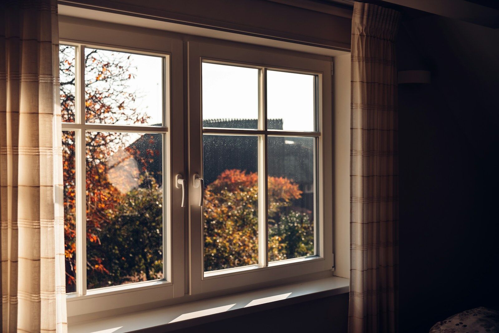
The interplay between lighting and colour is a critical factor that significantly shapes the ambience of your living spaces. Natural and artificial lighting has a transformative effect on how colours appear and feel within your home.
Natural light can vary throughout the day, casting warm or cool tones that can alter the perceived shade of your chosen colours. Similarly, warm or cool-toned artificial lighting can create different moods and visual effects.
Understanding the relationship between lighting and colour is vital in making informed decisions when selecting your colour palette.
A Unified Living Experience: Creating Cohesion with Consistent Colour Elements
Achieving a cohesive and visually harmonious home involves the strategic use of a common colour element that ties multiple rooms together. By selecting a unifying colour that appears throughout different spaces, you can establish a seamless flow and sense of continuity in your interior design.
Whether it’s a serene neutral, a vibrant accent, or a subtle pastel, this consistent colour choice acts as a thread that weaves through your home, connecting rooms and creating a unified living experience.
The use of a common colour element fosters a sense of balance and coherence, allowing each area to complement the others while reflecting your personal style and taste.
Painting Confidence: Sample and Test Your Colour Palette
Before making the final decision on your home design colour palette, it’s crucial to gain confidence in your choices through sampling and testing. Embracing this practical approach involves gathering paint samples and applying them to your walls.
By doing so, you can witness how different hues interact with the lighting conditions and existing decor in each room. Observing the colours in real-life scenarios helps you to visualize their impact on the overall ambience and aesthetics of your living spaces.
Additionally, testing multiple options side by side allows you to compare and contrast, ensuring that you make an informed and satisfying decision. If you’re feeling overwhelmed by the array of colour choices, you can consult with an interior designer in Vancouver for guidance in selecting the perfect palette that matches your style.
Selecting the Perfect Colour Palette for Your Home: In Conclusion

In conclusion, the art of selecting the perfect colour palette for your home is a multifaceted and transformative journey. From exploring different colour schemes to understanding the impact of lighting, each strategy plays a crucial role in crafting a harmonious and inviting living environment.
By finding your colour identity and adhering to the 60-30-10 rule, you can strike a visual balance that elevates the overall aesthetics of your space. Moreover, creating cohesion through a common colour element fosters a sense of unity and flow, while sampling and testing your chosen colours instils confidence in your final decisions.
Embracing these strategies empowers you to curate a colour palette that reflects your personal style, evokes the desired emotions, and creates a home that exudes warmth and beauty.




Leave A Comment